Get the Figma file with tons of slides that you can use for pitches, presentations, or anything in-between.
Tell me more
For some designers who don't know how to code, using Webflow is the first time that they have been given the keys to be able to develop websites from scratch. Without knowing the best practices, it's inevitable that this can turn into a recipe for disaster.
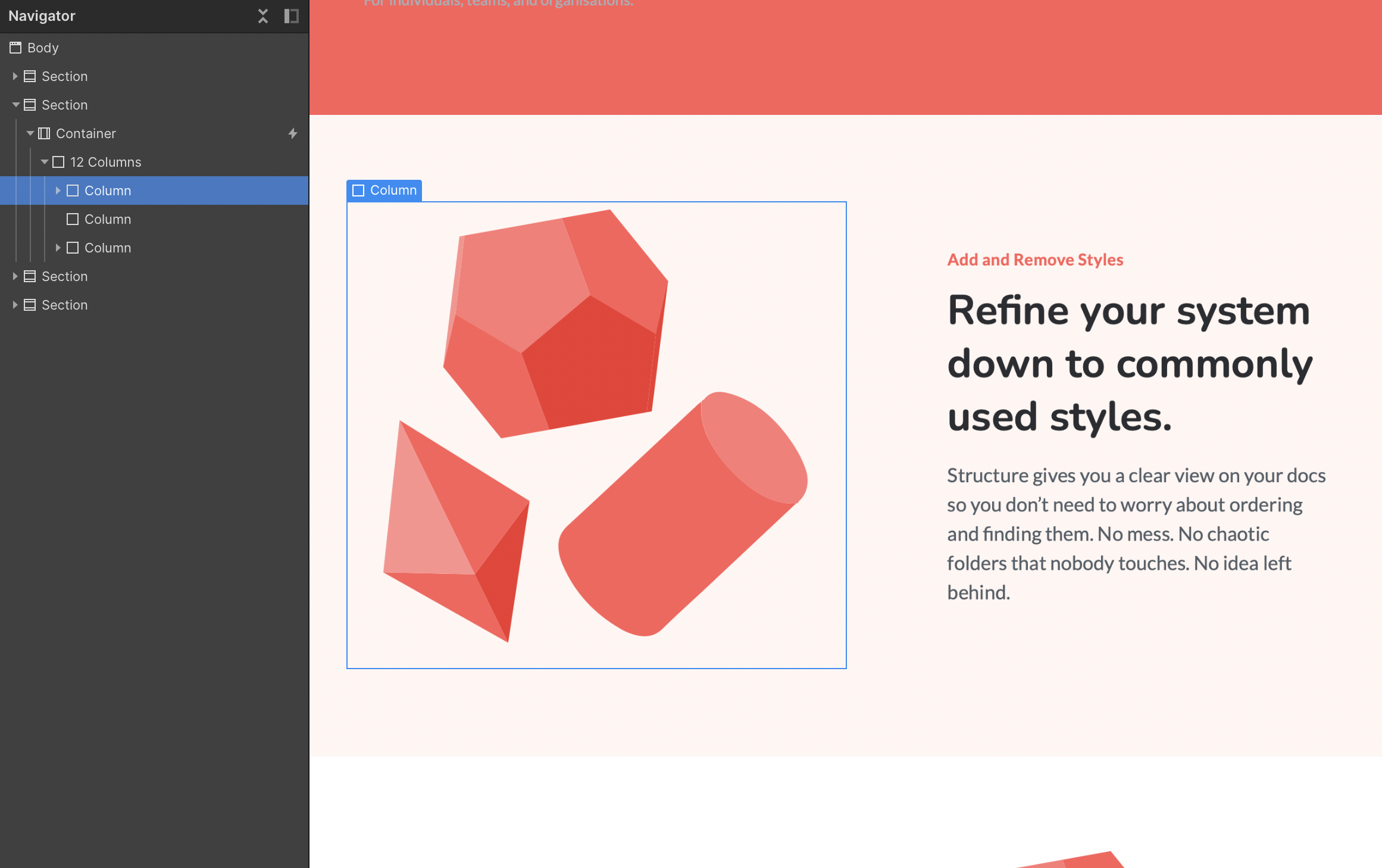
Websites that are built around a consistent system help keep them responsive on all devices, speed up the time taken to develop new pages, and make it faster to debug and add to as a company grows.
Starting without a blueprint of how the content is structured can lead to a website becoming messy fast. A common cause for this is when a website is developed to look right on desktop, but without factoring in how that design is going to change for different device screen sizes.
No matter how much your website is tuned to reflect your target customers, if your website is not initially built from a stable system, it's going to become harder and harder to manage.
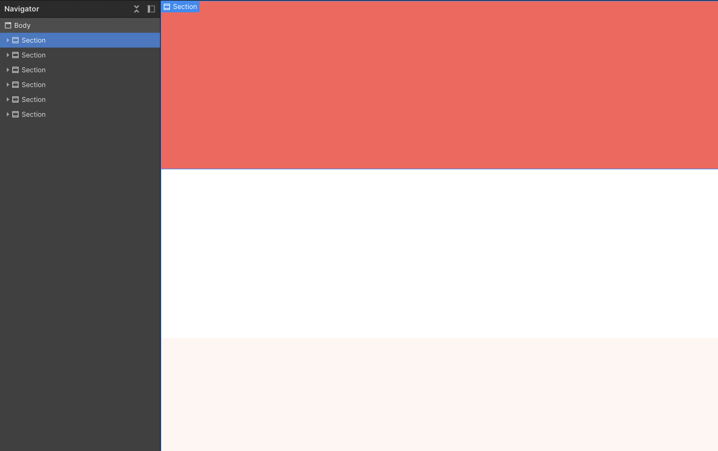
All websites are built with sections that fit perfectly one on top of the other, like the different floors of a building. Commonly, sections are split with a change in colour, change of layout, or just a large gap of space to indicate a separate idea. Building using sections makes it quick and easy to rearrange the order of content on a page.
When using Webflow, you can drop a section element into your project and give it a class of "Section", so that you can style it when needed. You can also give it some top and bottom padding, so the content inside isn't rubbing up against the edges. Alternatively, you can add some breathing room using spacers, which I will go into detail about later on.
It's a good practice to set up combo classes of the different coloured sections you are planning to use throughout your website, such as "Green", "Light Grey", and so on. This means you can quickly add or change the colour of a section at any point when you're building new pages.

Modern websites are built for the content to respond to any and all different device screen sizes. However, when a screen size gets too big, you don't want to have to develop a completely different layout where the content always stretches to the edge.
This is where containers come in. Containers create a limit of how wide the content can get. It means that on large screen sizes, it will still use the same design and layout as the regular desktop size.
You can either use Webflow's default containers, or if you want a different maximum width then you can add a blank div, give it a max width of your choice (around 1200px is common), and set left and right margins to auto, which will center it in the middle of the page.
Adding some left and right padding will then give the content some space on the edges when a screen size is smaller than the max width. Usually it will be around 30-40px on each side for desktop and tablet, and 15-20px on mobile, but you can adjust this to what suits your design best.
Webflow has a range of in-built elements that can be used for a variety of different layouts. The problem with this lies in the fact that often, designers using Webflow will build new layout styles each time they create new sections. This means that no classes are reused, and to update a page you have to individually go through every single element in each section.
To combat this, I use the same layout for 90% of the sections I build. This makes it faster for me to build new sections, adjust for different screen sizes, and explain to my clients the system used throughout the website.
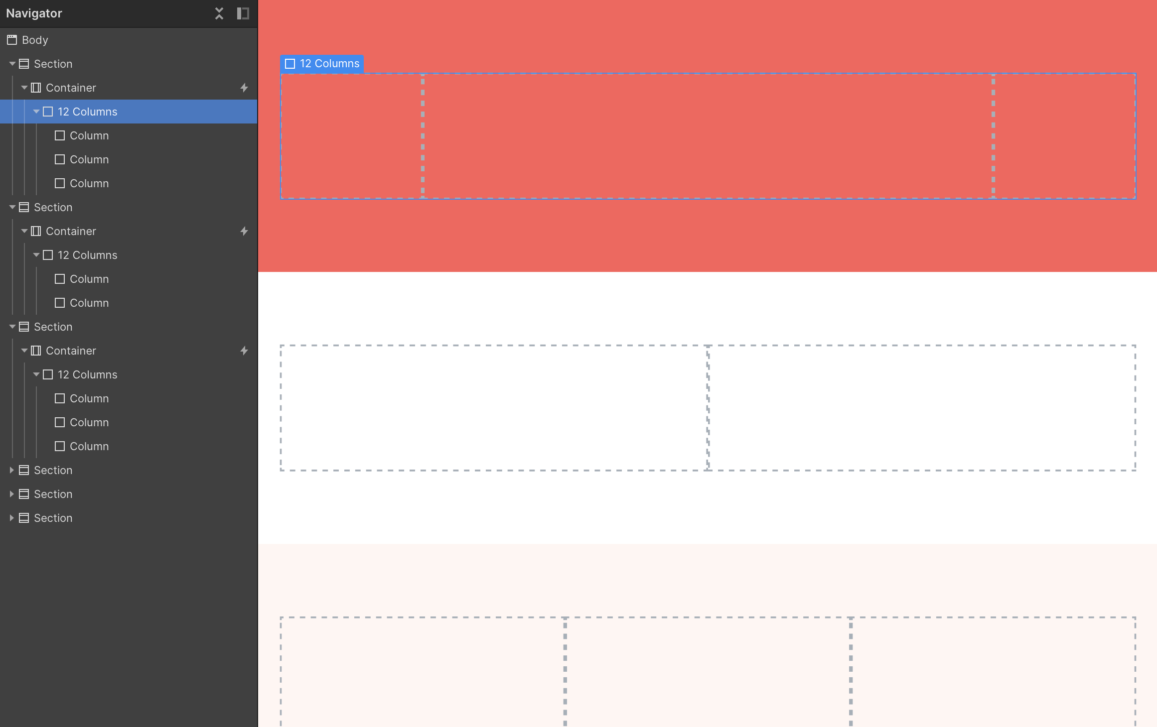
This layout is the 12-column grid, the same grid used for Bootstrap websites. It makes it easy to align everything in a clean and precise way across a website. It also becomes effortless to convert a design on Figma or Sketch for development if you’ve designed off of a 12-column grid.
Start with a Webflow template and have your new website up in no time.
To start, create a div and give it a "12 Column Row" class. Then add a margin of -16px on both the left and right of the element. This adjustment will mean that when we add our columns in, we can give them a 16px padding and everything will line up, while having plenty of space between columns.
Set your "12 Column Row" class to horizontal flex-box with wrap turned on, so if you go over 12 columns, it will be pushed to a new line.

Next you want to set up all the columns that go inside the 12 column row. Create a div and label it with a "Column" class, then give it a 16px left and right padding that I mentioned earlier. You can make the initial width any size as we are going to add combo classes to override how wide the column is.
Name your combo classes in any format, but I would recommend "Desk-1", "Tab-1" and "Mob-1". The name defines what screen size it's for, and the number defines how many columns the element takes up.
Next, we want to add in how wide the element actually is. To have everything to fit into 12 columns, we can work off of a percentage based system. 100% of the row, divided by the 12 columns, multiplied by how many columns the element takes up.
Therefore we would use “100%/12*4”, as it would take up 4 columns and equal 33.33%.
Once you've set up these columns, you can start to use them to create different layouts.
For example, a layout for a section could look like Desk-2, Desk-8, Desk-2. This adds up to the 12 columns and will perfectly fit within that row.
There are a couple of common ways to give content more breathing room throughout a design. A common one is to create combo classes called "bottom margin" or "top padding" and add them to sections or containers where needed.
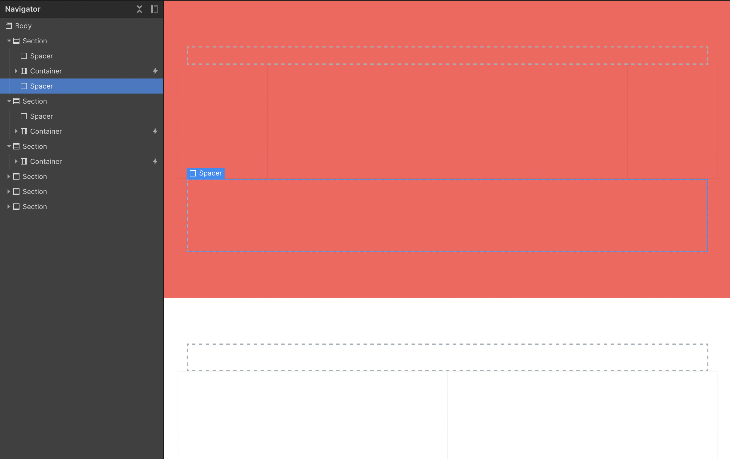
I find that this can get messy and prefer to use a separate spacer element that I can add anywhere where more space is needed. Again, this is only one way of doing it, so I would recommend you use the system that you're most comfortable with.
To set up a spacer system, create a new div and give it a "Spacer" class. You can set it up with any height to start, say 64px, and give it a background colour.
Next, add on combo classes that are the different sizes you will need, such as "32", "64", "128", etc. Then change the height accordingly, and adjust the background colour to be transparent so you don’t see the spacer.
Setting up a structured system means that you can build faster, with a more efficient workflow right from the start.
Every time you build a new section or page, you're doing it with the structure already in place, meaning you can streamline the time it takes to develop new pages tenfold.
You can make the system even easier to use inside of Webflow by setting up a drag a drop system through building sections into reusable symbols.
Getting used to a new system can take time, and you might find that only part of this system works for the way you or your team works. If so, I would suggest adapting to use only what is applicable for you and your team.

Written by
I'm a Webflow professional partner and template designer who helps users learn to use Webflow better.
More about me
Learn the strategies and best practices on how to maximise your Webflow website.

Learn about how to become a successful web design freelancer in 2021.
Learn More
Learn the step by step process of going from idea, to up and running web app using Webflow.
Learn MoreI've worked with countless businesses around the world. Maybe you'll be next.
Get in Touch